This packaging design of Mezzetta’s Kalamata Olives is for a high-end speciality market. The colors used are white and blue to represent the colors of the greek flag as well as a gold gradient to make it look more sophisticated. The main design element on the lid is a greek column with a kalamata olive on top. Above the vector illustration are the FDA food labeling because since the target audience is interested in buying the best product in quality. Thus, there is another label attached to the jar with more information on kalamata olives and a note that toothpicks are included. Buying this product not only does one get olives, but inside there is another glass container with toothpicks that way one can eat it around and easily grab an olive without getting your hands dirty.


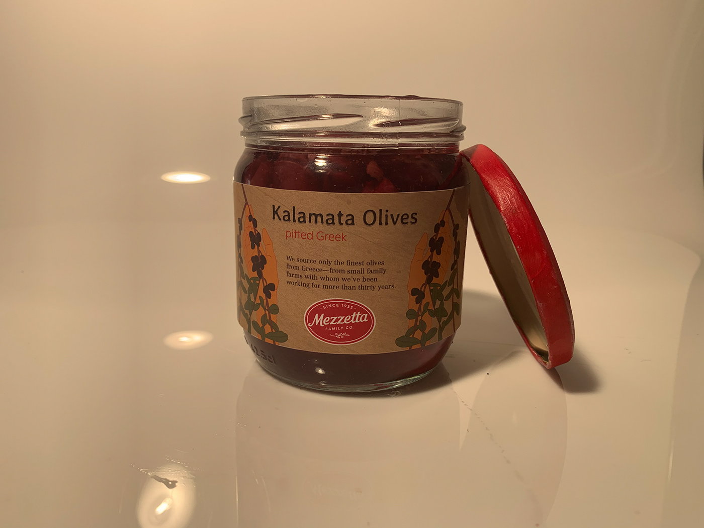
This packaging design of Mezzetta’s Kalamata Olives is for a low-end consumer market. The colors used are warm red, orange, green, and brown to emphasize the homey, traditional look. The main design element is a hand and an olive branch. The focus of the brand is how they are a family wanting to bring joy into our lives through their product, so the packaging reflects family values. The packaging consist of less things since the target audience is of people with middle to low income. The label is brown with a wooden texture to make it look more natural and fresh. The jar itself has a wide mouth, so it is easier to reach the olives.


